The Magic of Mimicking Randomization: An Intro to Propensity Score Matching
In the previous article, we ended with a problem. We needed to know if our in-store flyer campaign caused higher churn, but a clean A/B test was impossible. The real world was too messy.
So, are we stuck? Do we just give up and make a best guess?
Not even close.
We use a statistical method that allows us to mimic randomization using the data we already have. This method is called Propensity Score Matching (PSM), and for business analysts, it’s the closest thing to a magic trick we have.
Today, we’ll learn how this trick works—without the complex math.
The Goal: Finding a “Twins” in an Alternate Universe
Remember the fundamental problem: we need to know what would have happened to the customers who saw the flyer if they hadn’t seen it.
Since we can’t observe that, we do the next best thing. We find a group of customers who look and act exactly like the flyer customers but who, for whatever reason, did not use the flyer promo code.
We find their statistical twins. PSM is the process of finding these twins.
The Step-by-Step Magic Trick
Let’s walk through how we perform this magic on our flyer campaign data.
Step 1: The Propensity Score (The “Probability” of Treatment)
First, we need a way to measure how “similar” two customers are. We do this by calculating a Propensity Score for every customer.
- What it is: The probability that a customer would be in the treatment group (i.e., use the flyer promo code), given everything we know about them.
- How we get it: We train a simple model (like logistic regression) to predict
Used_Flyer_Code? (Yes/No)using all the confounding variables we have:age,credit_score,location,income, etc. - The Output: Each customer gets a score between 0 and 1. A customer with a score of 0.95 is very likely to use the flyer. A customer with a 0.02 score is very unlikely.
This single score brilliantly summarizes all the information we have about a customer that might predict their treatment status.
Step 2: The Common Support (Who Can We Compare?)
Next, we look at the range of these scores. Imagine a customer who is a 65-year-old millionaire with a perfect credit score. They are extremely unlikely to sign up for a credit card via a convenience store flyer. Their propensity score is nearly 0.
We can’t use them as a “twin” for a 24-year-old who just got their first job. They’re not comparable.
So, we restrict our analysis to customers whose propensity scores overlap. We only look for twins within a range where we have both flyer users and non-flyer users. This ensures we’re comparing apples to apples.
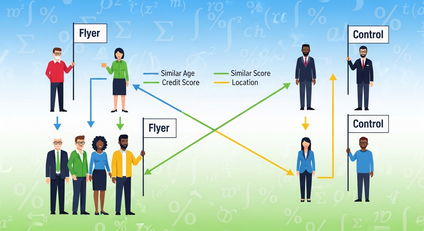
Step 3: Matching (Finding the Twins)
Now for the matching. For every customer who used the flyer code, we find one or more customers who didn’t use the code but have a nearly identical propensity score.
It’s like finding someone with the same height, weight, age, and fitness level to compare the effect of a new diet. The only difference left should be the diet itself—or in our case, the acquisition channel.
Common matching algorithms include:
- Nearest Neighbor: Find the single closest match.
- Caliper Matching: Only match if the scores are within a specified distance (e.g., ± 0.01), ensuring no poor matches.
- Stratification: Bucket the scores into ranges and compare treated and control within each bucket.
Step 4: Assessing Balance (Checking the Illusion)
This is the most critical step. How do we know the magic worked? How do we know our groups are truly twins?
We run a balance check. We go back and compare the two groups on all the original variables we cared about (age, credit_score, etc.). After matching, there should be no statistically significant difference between the flyer group and the matched control group on any of these variables.
If the groups are balanced, we’ve successfully recreated the conditions of a randomized experiment! We can now compare their outcomes.
The Grand Finale: The Causal Answer
Now, and only now, do we finally look at the churn rate.
We simply calculate:
Churn Rate (Flyer Group)Churn Rate (Matched Control Group)
The difference between these two rates is our Average Treatment Effect on the Treated (ATT). This is a robust, defensible estimate of the causal effect of the flyer campaign on customer churn.
- If the flyer group’s churn is higher: The campaign likely attracts a less loyal demographic.
- If the churn is the same: The campaign itself doesn’t impact loyalty.
- If the churn is lower: The campaign might attract more loyal customers!
The Catch (Because There’s Always One)
PSM is powerful, but it’s not sorcery. Its biggest limitation is that it can only account for observed and measured confounders. If a crucial variable is missing from our dataset (e.g., a customer’s “price sensitivity”), we cannot control for it. This is known as the “unobserved confounding” problem.
From Theory to Code
Understanding the theory is the first step. The next is learning how to execute it.
In the next article, we’ll get our hands dirty. I’ll provide a step-by-step Python walkthrough using a synthetic financial dataset, showing you exactly how to implement PSM, check for balance, and calculate the ATT.